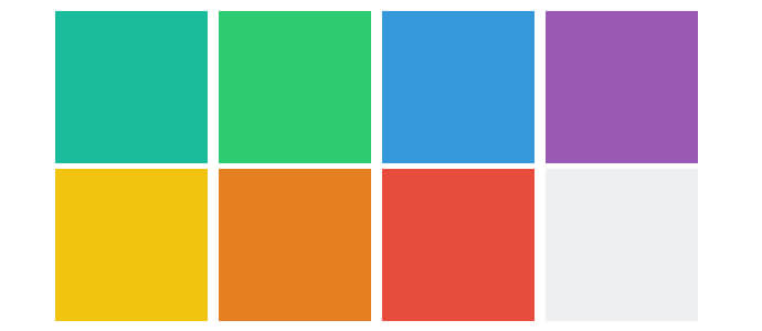
During a recent project, the designer wanted to create square elements for a gallery-style layout where the elements are laid out on a consistent grid. Is easy to make a square when you have fixed width and height.
.box {
    width:  200px;
    height: 200px;
}
This works great, but when we try to make it responsive using percentages, we realize that it does not function the way we want.
.box {
    width:  25%;
    height: 25%;
}
Simply using percentages does not work because the element’s width is calculated by its parent’s width and the height it’s calculated by its parent’s height. Since the width and height are of different measures, the square will not hold its shape.
The Solution(s)
After researching, I found that there are two main solutions that you can achieve this. Depending on your project you can choose on over the other one.
Using viewport-percentage
This is definitely the cleanest solution out there, however, according to http://caniuse.com/#feat=viewport-units there are some issues with different browsers and versions.
.box {
    width: 50vw;
    height: 50vw;
}
Using the :after pseudo-element
By making use of the padding-top, we can create a perfect square. While it sounds crazy, padding is calculated by the parent’s width, not height. This means you can use padding-bottom if we want. For this to work, we just need to remove the height property from the .box element.
.box {
  width: 50%;
}

.box:after {
  content: "";
  display: block;
  padding-top: 100%;
}
Since the pseudo element’s padding is calculated from the parent’s width, we are fixing its height. If the width of the .box is going to change, the height of the pseudo-element is going to change as well.
Adding Content
The solution above works perfectly if there is no content inside the .box element since it relies on having a height of 0. If we want to add content, the solution is going to break.
Fortunately, there is an easy way to fix this problem. We can place a position absolute div inside the .box. The new element is going to take the width and the height of its parent since is position absolute. Don’t forget to add position relative to .box
.box {
  position: relative;
  width: 25%;
}

.box:after {
  content: "";
  display: block;
  padding-top: 100%;
}

.content {
  position: absolute;
  width: 100%;
  height: 100%;
}
See the Pen Responsive Square Elements by Mihai Slujitoru (@MihaiSlujitoru) on CodePen.
Other Aspect Ratios
If you want to create other ratios, you can just change the padding-top percentage.
.ratio2_1:after{
	padding-top: 50%;
}
.ratio1_2:after{
	padding-top: 200%;
}
.ratio4_3:after{
	padding-top: 75%;
}
.ratio16_9:after{
	padding-top: 56.25%;
}