
There’s a whole lot of information out there about how to manage an email campaign. Whether it’s discussing how to write effective copy or explaining how to design an email drip campaign, the majority of Google results for “email marketing” are about what to do once you already have a substantial list.
And that’s all well and good — the importance of knowing strategies to make use of your list can’t be understated. But it does overlook a fundamental aspect of email marketing: learning how to get your list started in the first place and how to grow it over time.
Indeed, before you even think about writing your first email, you need to have a receiver. And to have a receiver, you need someone to sign up for your list.
So, in this article, we’re going to go over an underappreciated but crucial part of any email marketing campaign: the sign-up form. We’ll cover the architecture of a great email sign-up form and give you 7 tips to make forms that make your list grow faster than a group of rabbits in springtime.
The Elements of an Email Sign-up Form
Before we can get into how to improve email sign-up forms, we need to get a clear idea of all the elements that go into one. Luckily for us, there aren’t that many. Typically, an email sign-up form will include:
- Some persuasive copy
- One or more input boxes for personal information (name, email address, date of birth, etc.)
- A graphic
- A sign-up button
And that’s about it. While the components themselves are quite simple, getting them all to work nicely together and create a form that users can’t help but fill out is something of an art.
Making Art: Creating High-Converting Email Sign-up Forms
Now that we have a clearer idea of what goes into a sign-up form, let’s take a look at some techniques you can use to make some killer sign-up forms.
Tip #1: Get the Placement Right
If you were running a restaurant and wanted to give out takeaway menus to your customers, where do you think would be a better place to put them: at the front of the restaurant or in the restroom?
If you put them in the bathroom, chances are that very few people are going to walk away with them. But put them at the front, and you may get some positive results. The same concept holds true for email sign-up forms: if they’re not in the right place on your site, you’ll get very few sign-ups.
So, where is the right place to put your sign-up form? If you’re talking about a static form, you’ll generally want to put it on the top right sidebar on a high-traffic page, like so:

While the top right isn’t always the best choice, it’s so common that visitors will look there first if they actively want to sign up for your list. Because of that, it’s generally a good idea to include a sign-up form there.
However, there’s no reason you can’t have sign-up forms in multiple places. It’s also common practice to include a sign-up form at the bottom of your pages. That way, if someone is interested enough to make it to the bottom of your page, they’ll be led right to the form.
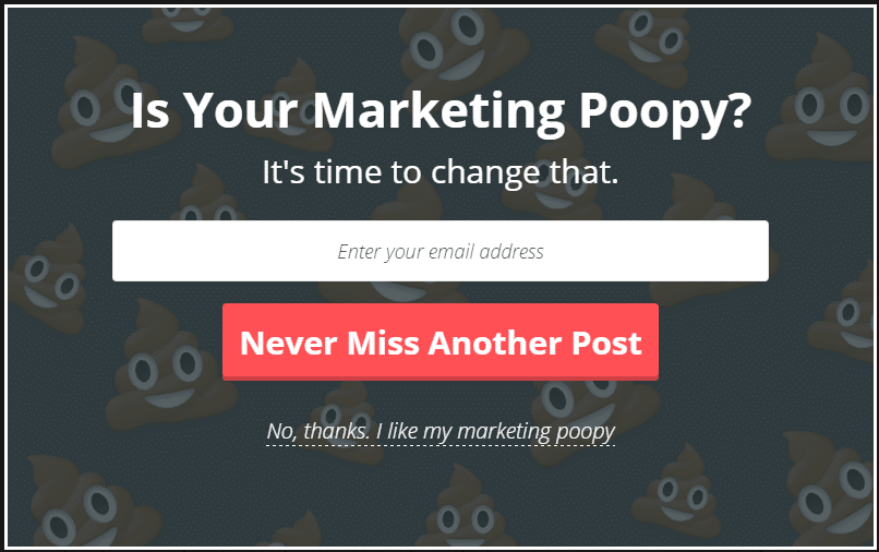
Tip #2: Don’t Use Pop-up Forms Unless You Really Understand Them
Pop-up forms can be tricky. In skilled hands, they can lead to stunning conversion rates of up to 40%. But when managed by a novice, they can be nothing short of disastrous. In fact, in a 2016 study, 50% of participants said that pop-ups were either “very annoying” or “extremely annoying.”
So, what exactly can make a pop-up either convert close to half of all your visitors or leave half of them irritated? The key is context. As Gary Veynerchuk says, “Content is King, but Context is God.”
If you want to make a successful pop-up form, you need to make it clear why your visitors are seeing it unexpectedly fill up their screens. In other words, it needs to be valuable enough to your visitors that they’re happy to have it shoved in their faces. That value can either come through a compelling argument, a coupon code, or some well-done humor.
For example, if a user has been looking at several different t-shirts but hasn’t made a purchase, you may see success by displaying a popup with a buy-one-get-one-free offer. Essentially, the offer is relevant and valuable enough to offset any annoyance the user might experience.
So, when it comes to email sign-ups, you need to find a way to persuade your visitors that your email list is extremely relevant and valuable to them. This is definitely possible, but if you don’t have a killer design, great copy, and a value factor, you’re better off dropping the popping.
Tip #3: Offer Something of Value In Exchange
In 2019, there were nearly 294 billion emails sent every single day. With so many emails making their way through cyberspace, people can be pretty hesitant to give out their address to a company that they believe will just end up sending them spam.
While being on an email list can be valuable in itself, some visitors may need a little extra convincing. Many businesses find success offering an ebook, free video training, or another useful extra in exchange for an email sign-up.
For example, this email sign-up form from Ampjar offers a free guide on Instagram marketing to anyone who signs up for its email newsletter:
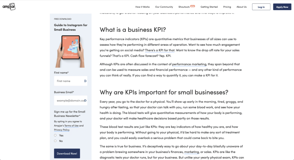
This is definitely one of the most powerful strategies out there. After all, who doesn’t love free stuff? If you have the resources to develop a freebie, this one’s a killer.
Tip #4: Consider Color
There’s been a longstanding debate in the marketing world as to whether color really has an effect on conversion rates. While color definitely does affect how people perceive your brand, the effect is less clear when it comes to specifics, such as whether your conversion button should be blue, green, or purple.
While there’s no consensus, data does indicate that the color of your CTAs can have a fairly drastic effect on your conversion rate. However, it’s not clear whether this effect was simply the result of one color being “better” for CTAs all around or whether one color fit better into the context of the site.
In the absence of any absolutes, you’re going to have to play scientist. Try split-testing different color schemes for your sign-up forms, and see which gives the best results. Make sure you only change one variable at a time so that you can get a clear idea of what’s (not) working.
One good general rule to follow, however, is that everything on your form should be clearly visible. So, at the very least, make sure your CTA button doesn’t fade into your site’s background, and your text is readable, unless your data indicates otherwise.
Tip #5: Make Signing Up Easy
Let’s conduct an experiment. Based solely on the following forms themselves (not the content you’ll receive), which of these two examples are you more likely to fill out:
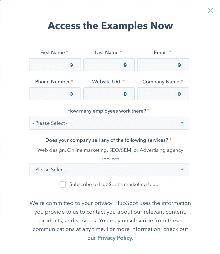
Or


The simple truth is that most users don’t want to spend a long time filling out a form. Not only does it take time, but most people are hesitant to share a lot of their personal information.
If you want to increase your conversions, you need to make your sign-up a smooth experience. As Brian Halligan puts it, “Dollars flow where friction is low.”
While there are cases in which collecting additional information can be warranted, you’ll generally do best by keeping your sign-up form as minimal as possible so that your visitors can type in their email and be on their merry way in just a few seconds.
Ideally, the sign-up experience should be a short one.
Tip #6: Stay On Brand
It’s no secret that brands that stay consistent in their presentation see higher revenue. Indeed, maintaining a stable brand image and tone is vital to your success.
When it comes to email sign-up forms, that means that not every technique you find online will work for your brand. For example, a fashion brand may see great success adding a bit of humor to their email sign-up forms, while the same technique employed by a financial firm may end up turning customers away.
Unless your split-testing shows that a departure from your brand identity is truly giving you some great results, stick to it.
Tip #7: Test Everything
Some rules are meant to be broken. There’s always a chance that even tried-and-true techniques simply don’t hold up when the numbers come rolling in. For that reason, you should take each and every tip on this list with a grain of salt until you can verify that it’s working using your own analytics tools.
Too much data is hardly ever a bad thing, so take some time to try out several colors, different copy, and a few different graphics until you find something that’s really working for you. At the end of the day, the proof is in the pudding, so if something works, it works. Don’t question it.
Armed with these tips, you should be ready to make some sign-up form magic. If there’s anything you think we missed, make sure to send us an email at hello@sodawebmedia.com.