
Imagine you had a crystal ball that let you see exactly what your customers think when they visit your website. This magical orb could tell you precisely what they found the most interesting, what they found boring, and what they found flatout confusing. Pretty useful, right?
Unfortunately, crystal balls are pretty hard to come by, and we’re a long way off from being able to hook people up to a machine and read their minds.
But we’ve got something almost as good: website heatmaps.
Although they don’t run on magic, the results they can provide you are often nothing short of magical. Here, we’re going to run you through the basics of website heatmapping and fill you in on why you should be adding heatmaps to your web analytics stack.
What Is Heatmapping?
Heatmapping is a way to visually represent data about your website’s visitor’s actions. Heatmaps use colors to record the frequency of specific actions that users take, such as clicking a link or mousing over part of the page.
The easiest way to understand heat mapping is to take a look at it for yourself:

Let’s break down what we’re seeing here: we’ve got a webpage in the background and a heat map overlaid on top of it. The heatmap overlay uses different colors to represent how popular various parts of the site are. Areas that get more attention (typically based on the number of clicks or mouseovers) are represented by increasingly red shades while unpopular parts are depicted as being more blue — the standard hot and cold colors.
Business and web designers can use heatmaps to make decisions about how to better organize and optimize a site. For example, if a business is hoping to get a lot of clicks on their landing page video, but the play button is showing up in blue on the heatmap, they may opt to redesign the video player to draw more attention to it and encourage clicks. Alternatively, if the heatmap is showing that important content is getting very few mouseovers, a web designer might decide to move it further up the page to improve visibility.
Four Types of Heat Maps
Not all heatmaps are the same. There are four different types available, each with slightly different use cases.
Click Maps
Click maps are pretty self explanatory: they provide a visual representation of what parts of your site most users click on. For mobile users, it will depict the spots that they tapped on.
Click maps are most useful for understanding which parts of your site users take action on. When combined with hover maps, which we’ll go over next, they can give insight into the parts of your site that are getting attention but aren’t generating clicks.

Hover and Move Maps
Hover maps, sometimes referred to as move maps, represent where visitors place their cursors as they look through a website. Since mobile users don’t have persistent cursors, this type of heat map can only provide data on desktop visitors.
You can use this type of heat map to get a general idea of what parts of your site users found interesting — or not interesting enough. Some users will unconsciously mouse over the parts of the site they’re looking at, and this heat map will show that activity.
Similarly, it can also tell you which menu items your users looked into, and which non-clickable parts of your site your users were distracted by. If you notice that there’s a lot of hover activity over an unlinked image, that may indicate that visitors are trying to click it, and you may want to turn it into a link to help traffic flow to your other pages.
However, when combined with click maps, it can sometimes help you find hidden issues with your website. For example, if you see a red hot portion of your site on the hover map, but its deep blue on your click map, that might represent a problem: visitors are hovering over a link, but deciding not to click. With this knowledge in hand, you can look into ways to fix this problem and generate more clicks.

Scroll Maps
Compared with the other types of heat maps, scroll maps are less precise, but that doesn’t mean they can’t offer important data. As you can gather from the name, scroll maps display how far users scroll down a page. They look like this:
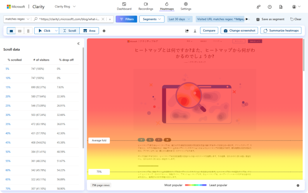
Some of the data you’ll get from a scroll map will be pretty obvious — the top is always going to be the deepest red, and the colors will typically become colder as you go down.
However, it can still be useful to see precisely how far most users are making it down your page. For example, if you have a “Contact Us” button at the bottom of your site, but your scroll map is showing that hardly anyone scrolls that far, you may want to move that button closer to the top for increased visibility. Then, you can get more precise data on who’s hovering over it and clicking it with your hover and click maps.
Eye Tracking Heatmaps
These heatmaps track eye movements to gain insight into which parts of a website are most visually engaging. This isn’t a tech that you can simply deploy on your site — you would need to have participants look through your site in a lab environment with specialized equipment. It can be very useful, but it isn’t particularly accessible, and it’s overkill for most websites.
Why You Should Use Heatmaps
Heatmaps provide insight into how visitors use and interact with your website. They can tell you:
- What parts of your website are getting the most attention
- What parts of your website are getting less attention than you would have hoped
- How easily your visitors are finding the key parts of your site, like CTAs and opt-ins
- Whether visitors are distracted by non-clickable site elements
Once you’ve gathered this data, you can use them to make improvements to your website. If you aren’t getting enough clicks on your CTAs, for example, you can try changing their colors or positions to encourage more activity.
Some heatmap software will even let you segment your maps so that you can get precise data on how different demographics are interacting with your website.
All that said, the bottom line is this: knowledge is power, and heatmaps provide lots of it. By better understanding your visitors’ usage patterns, you can tailor your website to their needs and preferences, and increase its efficiency as a result. For you, that means more conversions — and who doesn’t want that?
If you want to get the most out of your web presence, get in touch with a shopify web developer to find out how you can integrate heatmaps into your website.